This article first appeared in the Simply Secure Knowledge Base.
The writing in your user interface is an opportunity to encourage people to use your product. Writing in interfaces includes everything from the words in an in-app setup tutorial to a website's navigation menu. Because there is both technical complexity and high stakes for user failure, careful language is key to getting mass audiences to adopt secure communication tools.
Good writing for an interface, also called user-experience (UX) copywriting, does two things:
- it explains how things work, and
- it creates an emotional reaction with the user.
Explanations in language people understand
Explaining how things work isn't straightforward. Many secure communication apps struggle with conveying too much technical information to an overwhelmed user who, for example, doesn't care about the difference between DSA and RSA keys. Careful UX copywriting avoids this pitfall.
Even a simple explanation can create a negative emotional reaction when it sounds like jargon to a general audience. Jargon is off-putting, whether it's Silicon Valley buzzwords or bureaucratic govermentese, because it conveys that the service is untrustworthy. To stamp out jargon, Mail Chimp's Content Style Guide on GitHub includes this list of words to avoid using.They've flagged a bunch of corporate-speak words as inappropriate. Mail Chimp is a sales tool for sending customized email and newsletters, so "Incentivizing your ninjas to crush it!" could be a reasonable explanation of their value to their customers who are marketing professionals, but their writing is careful to use vocabulary that is accessible to a broader audience.
Reducing the need for support
With good UX copywriting directly in the interface, the need for training and other kinds of support decreases. Consider this excerpt from 18F's writing guide for U.S. Government websites:
"FAQs are bad. We don't like them. If you write content by starting with user needs, you won't need to use FAQs. … If you're thinking about adding FAQs, consider reviewing the content on your website that is generating questions and think about how you can change the content or design to answer the question — or provide an answer in context to prevent people from visiting an additional webpage to find the answer." – 18F Content Guide
Similarly, the Gov.UK writing guide does a good job of explaining how to make complex information accessible to a broad audience. Just as a piece of consumer software must be understandable to many types of users to be successful, UK government publications must reach and be useful to a broad spectrum of readers, from English-language learners, to populations with low levels of literacy, and citizens with a range of accessibility challenges.
Resources for UX copywriting
In addition to complete style guides, here are some practical tips:

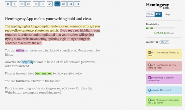
Screenshot from Hemingway App, showing dynamic highlighting as you type
My favorite suggestion (which makes both lists) is to be make your writing shorter. To trim excess words, try the Hemingway App. It was named after the writer whose work was famous for its short, clear sentences.
 Blogs
Blogs  Recent Bloggers


